
By submitting your email address, you agree to receive periodic communications from Communication Partners, Inc. We will never share your information with third parties or social marketing firms.
Transform the way employees engage with benefits through the magic of infographics. Using infographics to communicate important benefits information allows employees to absorb essential details, creating a dynamic and immersive experience. The result? A deeper grasp of benefits knowledge, leading to a greater appreciation of the plans offered and a higher level of plan usage.
Help employees focus on what’s most important. Benefits packages encompass a wide array of offerings, ranging from medical, vision, and dental coverage to Employee Assistance Programs (EAPs) and life insurance. However, the sheer volume of information can often become overwhelming and confusing, resulting in more questions for HR. By translating key details into visually appealing infographics, your workforce can better understand and make informed decisions about their benefit options.
To effectively convey the diverse benefits your company provides, it’s crucial to select the right type of infographic. LinkedIn identifies eight essential infographic categories: geographic, timeline, hierarchical, list, comparison, informational, statistical, and process—each with its own unique strengths. For the purpose of benefits communication, we focus on four effective options:

A split-screen approach, either vertically or horizontally, can compare various health benefits or wellness plans side by side. This technique is ideal for illustrating the distinctions between Health Savings Accounts (HSAs) and Flexible Spending Accounts (FSAs), enabling employees to find the right choice for their needs.
These infographics quickly summarize processes or topics. Consider utilizing them to explain intricate benefit procedures so your employees can grasp the essence without getting lost in the details. A good choice for this is an infographic which shows the pros and cons of care locations based on healthcare needs.

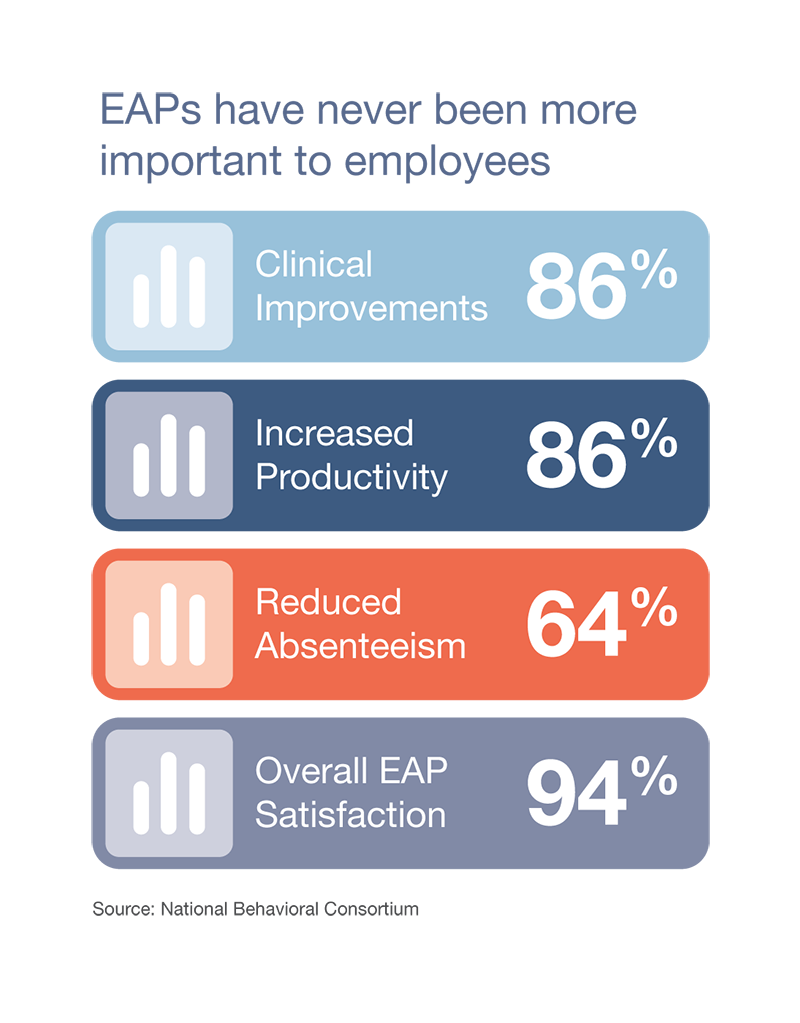
For data-driven insights, statistical infographics are a great tool. When promoting retirement plans like 401(k)s or highlighting the value of EAPs, presenting statistics can be effective. Use this infographic style to showcase relevant details of a program’s success to encourage participation.
When outlining a step-by-step process, such as enrolling in benefits, process infographics shine. By visually breaking down complex procedures into manageable stages, you ensure that employees can confidently navigate the enrollment process and make informed choices.

In a world inundated with information, capturing your employees’ attention and ensuring comprehension is more important than ever. Infographics offer a meaningful solution by transforming potentially misunderstood benefits into easily digestible visuals. This helps employees select benefits that align with their individual needs, promoting a sense of ownership and appreciation.
Your company’s benefits are a powerful asset, and by harnessing infographics, you can unlock their full potential. Make a lasting impact by crafting visually appealing, captivating, and user-friendly infographics that allow your employees to navigate the intricate landscape of benefits with confidence. As you pave the way for a more informed and engaged workforce, you not only enhance your company’s culture but also set the stage for employee well-being and satisfaction.
Contact our award-winning experts.
View our product videos.
Download the possibilities.
We use cookies to improve your experience on our site. By using our site, you consent to cookies.
Manage your cookie preferences below:
Essential cookies enable basic functions and are necessary for the proper function of the website.
You can find more information in our Privacy Policy and .
Click the button below to view and download your FREE Enrollment Toolkit.
Providing the highest level of hospitality is important to us. Surveys give us the feedback we need to continually meet this goal. We’re pretty proud of our Net Promoter Score (NPS). Here’s why:
NPS is based on the percentage of survey respondents who are promoters, passives, and detractors:
Scores range from -100 to 100. The higher the score, the higher the percentage of promoters versus detractors.
| Above 0: Good |
| Above 20: Favorable |
| Above 50: Excellent |
| Above 80: World Class |
*Bain & Company, creators of NPS