Why Visuals Drive Better Decisions
Benefits information is complex. Plans, costs, eligibility rules, timelines, and tradeoffs all compete for attention, often when employees are already overwhelmed. The challenge for brokers and employers isn’t just accuracy. It’s clarity.
And clarity doesn’t come from more detailed explanations. It comes from better design.
Benefits communication is still largely built on text: paragraphs, definitions, and long explanations meant to cover every detail. But employees aren’t reading benefits materials like a textbook. They’re scanning, comparing, and trying to answer one simple question:
What does this mean for me?
When everything is written in the same format—usually paragraphs and paragraphs of text with the occasional table—everything feels equally important.
Visuals change that. They organize information, guide attention, and make tradeoffs visible. They don’t just support understanding, they create it.
Instead of asking employees to interpret explanations, visuals organize information and guide attention to what matters most. This clarity is especially critical during Open Enrollment and life events, when decisions are time-sensitive and emotions may be high, making it more likely that people will get confused and frustrated.
Most benefits communication doesn’t fail because it’s wrong. It fails because everything is presented at the same level. When every detail is emphasized, nothing stands out. Employees get stuck when they don’t know where to start, what to focus on, and what matters most.
Visual communication solves that by creating hierarchy. It helps employees quickly understand what to look at first, what’s different, and what they need to do next. And that’s what drives action.
Making content more visual isn’t just about making things look nicer, although that certainly doesn’t hurt. It’s about making them easier to use.
Starting with visuals early leads to:
Instead of asking employees to decode paragraphs, visuals show them what matters.
Visuals work best when they enhance the narrative, not when they’re added at the end. When visual thinking happens early, it changes how information is structured from the start. Instead of organizing content around what needs to be included, teams begin organizing around what employees need to understand.
Starting early leads to:
It’s not just more efficient. It’s about crafting communications that clearly reflect what’s most important.
“Making things more visual” isn’t just about removing detail. It’s about organizing it, so employees can prioritize it. The best benefits communication doesn’t eliminate information, it layers it.
Visuals support orientation and comparison. Content supports depth and detail. Together, they support decision-making.
That shift makes information easier to navigate without sacrificing accuracy.
At CPI, visuals aren’t treated as an add-on. They shape how information is structured from the beginning.
That means:
And when benefits are designed to be seen, not just read, employees are more confident, more engaged, and better equipped to make decisions.
Clarity doesn’t come from saying more. It comes from showing what matters.
When benefits communication is designed with that in mind, complex decisions feel simpler, employees feel supported, and communication works the way it’s intended to.
If you’re ready to make benefits communication easier to understand, CPI is here to help. Reach out today by emailing hello@commpart.com.
Contact our award-winning experts.
View our product videos.
Download the possibilities.
By submitting your email address, you agree to receive periodic communications from Communication Partners, Inc. We will never share your information with third parties or social marketing firms.
We use cookies to improve your experience on our site. By using our site, you consent to cookies.
Manage your cookie preferences below:
Essential cookies enable basic functions and are necessary for the proper function of the website.
You can find more information in our Privacy Policy and .
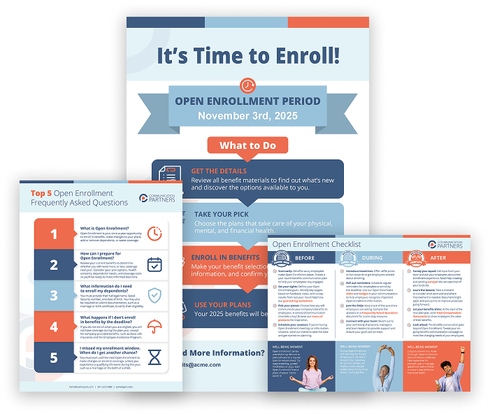
Click the button below to view and download your FREE Enrollment Toolkit.
Providing the highest level of hospitality is important to us. Surveys give us the feedback we need to continually meet this goal. We’re pretty proud of our Net Promoter Score (NPS). Here’s why:
NPS is based on the percentage of survey respondents who are promoters, passives, and detractors:
Scores range from -100 to 100. The higher the score, the higher the percentage of promoters versus detractors.
| Above 0: Good |
| Above 20: Favorable |
| Above 50: Excellent |
| Above 80: World Class |
*Bain & Company, creators of NPS