
By submitting your email address, you agree to receive periodic communications from Communication Partners, Inc. We will never share your information with third parties or social marketing firms.
We’re approaching our 50th year as a communications company and we think that’s something to celebrate! But first, we need some new party clothes. Cue our gorgeous rebrand.
We’re all about innovation—in fact, it’s one of our core values. To us, it’s more than just a word on paper; it’s the forward-thinking, creative spirit we bring to everything we do. As we’ve evolved as a company, we think this is the perfect time for our logo to reflect who we are today.
Our old logo served us well. With a ring of speech bubbles within our name, it did its job of communicating who we are: a trusted communications partner. But we’ve grown into so much more than that, and now we’re making the change to show it.
After careful consideration, we moved our image in a fresh, modern direction. Although we have updated our entire brand identity, we wanted to carry forward a piece of our old logo as a reminder of our roots. You can see our redesigned speech bubble hiding in the center of our new logo.
As a creative communications company, we are always looking for ways to streamline our messaging—to apply more meaning with fewer words and break down complex concepts into easily understandable content. With this in mind, we conducted extensive studies to find the most concise, meaningful representation of our brand and imagery. Color analysis, typography, message development, and logo studies were presented and refined until we established the final product.
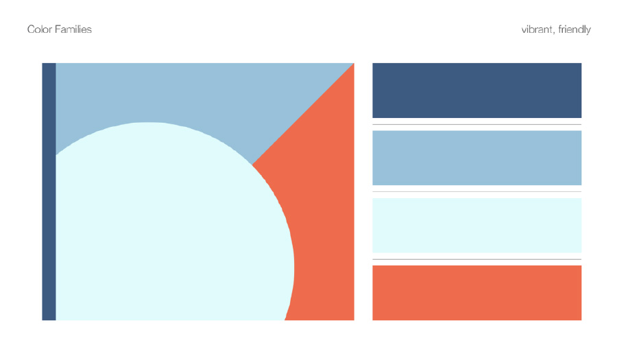
Color plays a significant role in any design. We developed several palette samples to find the one that represents the feelings we wish to inspire when viewing our logo. After careful review, we landed on a vibrant, friendly palette. It’s a perfect fit.
Next, we refined our brand messaging to embody our core values and culture. We used an all-hands-on-deck approach to ensure our entire team was involved in the creation and selection of our new look and feel. Our updated message now captures the entirety of the CPI team and better communicates who we are and what we do.
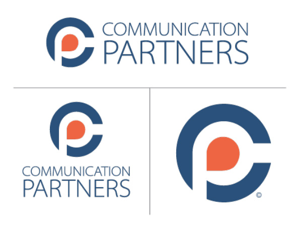
Our new logo is beautiful, compact, dynamic, and scalable. We incorporate a simplified orange speech bubble at the heart of a blue C, allowing the negative space to define the letter P. The company name is presented using a clean, sans serif font and shown justified and stacked. We’re thrilled with the result!
The past 50 years has established us as a leader in our industry. Our new brand showcases our commitment to innovation and progress, guiding us into the future in style. We’d love to hear what you think of our new look.
We use cookies to improve your experience on our site. By using our site, you consent to cookies.
Manage your cookie preferences below:
Essential cookies enable basic functions and are necessary for the proper function of the website.
You can find more information in our Privacy Policy and .
Click the button below to view and download your FREE Enrollment Toolkit.
Providing the highest level of hospitality is important to us. Surveys give us the feedback we need to continually meet this goal. We’re pretty proud of our Net Promoter Score (NPS). Here’s why:
NPS is based on the percentage of survey respondents who are promoters, passives, and detractors:
Scores range from -100 to 100. The higher the score, the higher the percentage of promoters versus detractors.
| Above 0: Good |
| Above 20: Favorable |
| Above 50: Excellent |
| Above 80: World Class |
*Bain & Company, creators of NPS